BK101
Knowledge Base
Color - Colours
Color is a visual attribute of things that results from the light they emit or absorb or reflect. The appearance of objects or light sources described in terms of a person's perception of their hue and lightness or brightness and saturation. Did you know that the world's favorite color is blue? How do Colors make you Feel?
 CMYK vs RGB Info-Graph (image)
What is the difference between RGB and CMYK? (youtube)
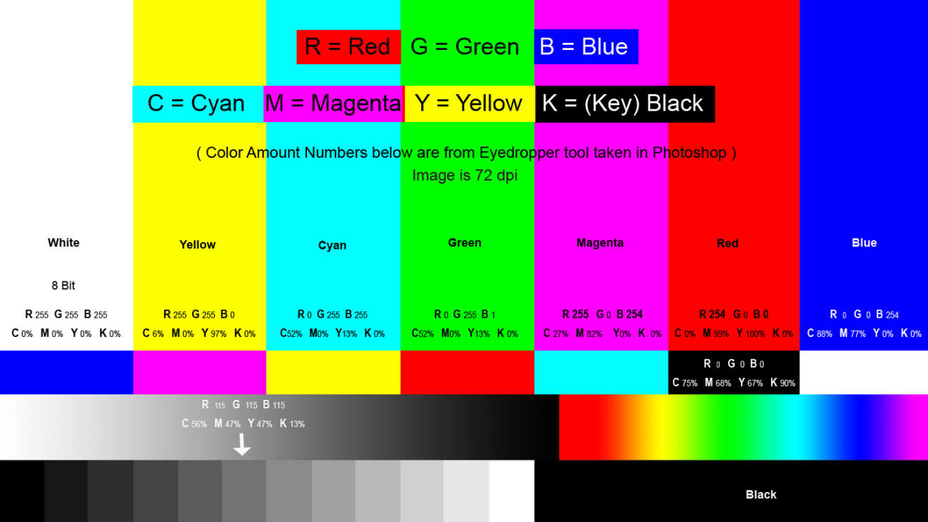
RGB is an additive color model in which red, green and blue light are added together in various ways to reproduce a broad array of colors. The name of the model comes from the initials of the three additive primary colors, red, green and blue. The main purpose of the RGB color model is for the sensing, representation and display of images in electronic systems, such as televisions and computers, though it has also been used in conventional photography. Before the electronic age, the RGB color model already had a solid theory behind it, based in human perception of colors.
Additive Color is color created by mixing a number of different light colors, with shades of red, green, and blue being the most common primary colors used in additive color system.
CMYK is a subtractive color model, used in color printing, and is also used to describe the printing process itself. CMYK refers to the four inks used in some color printing: cyan, magenta, yellow and key (black). Though it varies by print house, press operator, press manufacturer, and press run, ink is typically applied in the order of the abbreviation.
Subtractive Color explains the mixing of a limited set of dyes, inks, paint pigments or natural colorants to create a wider range of colors, each the result of partially or completely subtracting (that is, absorbing) some wavelengths of light and not others. The color that a surface displays depends on which parts of the visible spectrum are not absorbed and therefore remain visible. Subtractive color systems start with light, presumably white light. Colored inks, paints, or filters between the watchers and the light source or reflective surface subtract wavelengths from the light, giving it color. If the incident light is other than white, our visual mechanisms are able to compensate well, but not perfectly, often giving a flawed impression of the "true" color of the surface. Conversely, additive color systems start with darkness. Light sources of various wavelengths are added in various proportions to produce a range of colors. Usually, three primary colors are combined to stimulate humans’ trichromatic color vision, sensed by the three types of cone cells in the eye, giving an apparently full range.
Pantone Colors Matching System is largely a standardized color reproduction system. By standardizing the colors, different manufacturers in different locations can all refer to the Pantone system to make sure colors match without direct contact with one another.
Chromatic Color is a color that has hue. Hue is the quality of a color as determined by its dominant wavelength.
Chromaticity is an objective specification of the quality of a color regardless of its luminance. Chromaticity consists of two independent parameters, often specified as hue (h) and colorfulness (s), where the latter is alternatively called saturation, chroma, intensity, or excitation purity. This number of parameters follows from trichromacy of vision of most humans, which is assumed by most models in color science.
Electromagnetic Spectrum (visible spectrum - color spectrum)
Luminescence (chemical reactions)
Prisms (colors in the light) - Schlieren Optics
Rainbow is a meteorological phenomenon that is caused by reflection, refraction and dispersion of light in water droplets resulting in a spectrum of light appearing in the sky. It takes the form of a multicoloured arc. Rainbows caused by sunlight always appear in the section of sky directly opposite the sun. Rainbows can be full circles. However, the observer normally sees only an arc formed by illuminated droplets above the ground, and centred on a line from the sun to the observer's eye. In a primary rainbow, the arc shows red on the outer part and violet on the inner side. This rainbow is caused by light being refracted when entering a droplet of water, then reflected inside on the back of the droplet and refracted again when leaving it. In a double rainbow, a second arc is seen outside the primary arc, and has the order of its colours reversed, with red on the inner side of the arc. Halos (ice). This is Not a Rainbow (youtube) - The existence of the rainbow depends on the conical photoreceptors in your eyes. To animals without cones, the rainbow does not exist.
Moonbow is a rainbow produced by moonlight rather than sunlight. Other than the difference in light source, its formation is exactly the same as for a solar rainbow: It is caused by the refraction of light in many water droplets, such as a rain shower or a waterfall, and is always positioned in the opposite part of the sky from the moon relative to the observer.
Refraction is the change in direction of wave propagation due to a change in its transmission medium or when passing from one medium to another. The amount by which a propagating wave is bent. Propagation are the ways in which waves travel.
Iridescence is the phenomenon of certain surfaces that appear to gradually change colour as the angle of view or the angle of illumination changes. Examples of iridescence include soap bubbles, butterfly wings and seashells, as well as certain minerals. It is often created by structural coloration (microstructures that interfere with light). Pearlescence is a related effect where some or all of the reflected light is white, where iridescent effects produce only other colours. The term pearlescent is used to describe certain paint finishes, usually in the automotive industry, which actually produce iridescent effects. Engineers make clear droplets produce iridescent colors.
Kaleidoscope is an optical instrument with two or more reflecting surfaces tilted to each other in an angle, so that one or more (parts of) objects on one end of the mirrors are seen as a regular symmetrical pattern when viewed from the other end, due to repeated reflection. The reflectors (or mirrors) are usually enclosed in a tube, often containing on one end a cell with loose, colored pieces of glass or other transparent (and/or opaque) materials to be reflected into the viewed pattern. Rotation of the cell causes motion of the materials, resulting in an ever-changing view being presented.
World’s Most Visible Color. Nano Meter 555 Midlayer with Motion Capture Markers is designed to make you highly visible in any light condition anywhere on earth – combining insights from experimental psychology, the mechanics of the human eye and material technology, as well as tapping into the brain’s pattern recognition system. In daylight, the intense green colour replicates the wavelength of light that the human eye is most sensitive to. At night, retroreflective Motion Caption Markers light up when hit by any passing light source, creating a pattern that the eye can process as recognisably human in 0.25 seconds.
Engineers develop 'Blackest Black' material to date. Made from carbon nanotubes, the new coating is 10 times darker than other very black materials. Vantablack is one of the darkest substances known, absorbing up to 99.965% of visible light (at 663 nm if the light is perpendicular to the material). Outer Space.
Spatial Intelligence (space and object awareness) - Eyes (sight)
Color Depth is either the number of bits used to indicate the color of a single pixel, in a bitmapped image or video frame buffer, or the number of bits used for each color component of a single pixel.
Pixel is a physical point in a raster image, or the smallest addressable element in an all points addressable display device; so it is the smallest controllable element of a picture represented on the screen. The address of a pixel corresponds to its physical coordinates. LCD pixels are manufactured in a two-dimensional grid, and are often represented using dots or squares, but CRT pixels correspond to their timing mechanisms. Each pixel is a sample of an original image; more samples typically provide more accurate representations of the original. The intensity of each pixel is variable. In color imaging systems, a color is typically represented by three or four component intensities such as red, green, and blue, or cyan, magenta, yellow, and black. In some contexts (such as descriptions of camera sensors), the term pixel is used to refer to a single scalar element of a multi-component representation (more precisely called a photosite in the camera sensor context, although the neologism sensel is sometimes used to describe the elements of a digital camera's sensor), while in yet other contexts the term may be used to refer to the set of component intensities for a spatial position, though this is more accurately termed a sample. Drawing a distinction between pixels, photosite and samples avoids confusion when describing color systems that use chroma subsampling or cameras that use Bayer filter to produce color components via upsampling. The word pixel is based on a contraction of pix (from word "pictures", where it is shortened to "pics", and "cs" in "pics" sounds like "x") and el (for "element"); similar formations with 'el' include the words voxel, texel and maxel (for magnetic pixel).
Color Chart is a flat, physical object that has many different color samples present. They can be available as a one-page chart, or in the form of swatchbooks or color-matching fans. Typically there are two different types of color charts: Color reference charts are intended for color comparisons and measurements. Typical tasks for such charts are checking the color reproduction of an imaging system, aiding in color management or visually determining the hue of color. Examples are the IT8 and ColorChecker charts. Color selection charts present a palette of available colors to aid the selection of spot colors, process colors, paints, pens, crayons, and so on – usually the colors are from a manufacturers product range. Examples are the Pantone and RAL systems.
Color Wheel is an abstract illustrative organization of color hues around a circle, which shows the relationships between primary colors, secondary colors, tertiary colors etc.
Primary Color is an additive set of colors used, like red, green and blue. In a subtractive set of colors, mixing of pigments or dyes for printing, the colors magenta, yellow and cyan are normally used. Primary Color is a small, arbitrary set of pigmented physical media, lights or purely abstract elements of a mathematical colorspace model. Distinct colors from a larger gamut can be specified in terms of a mixture of primary colors which facilitates technological applications such as painting, electronic displays and printing.
Secondary Color is a color made by mixing two primary colors in a given color space.
Color Therapy (meditation) - Psychology of Color - Color Symbolism
Color Theory is a body of practical guidance to color mixing and the visual effects of a specific color combination. There are also definitions (or categories) of colors based on the color wheel: primary color, secondary color and tertiary color, which is a color made by mixing full saturation of one primary color with half saturation of another primary color and none of a third primary color, in a given color space such as RGB, CMYK (more modern) or RYB (traditional).
Complementary Colors are pairs of colors which, when combined, cancel each other out. This means that when combined, they produce a grey-scale color like white or black. When placed next to each other, they create the strongest contrast for those particular two colors. Due to this striking color clash, the term opposite colors is often considered more appropriate than "complementary colors". Which pairs of colors are considered complementary depends on the color theory one uses: Modern color theory uses either the RGB additive color model or the CMY subtractive color model, and in these, the complementary pairs are red–cyan, green–magenta, and blue–yellow. In the traditional RYB color model, the complementary color pairs are red and green, yellow and purple and blue and orange, though these pairings fail the modern definition of complementary colors, as they produce a brown color when combined. Opponent process theory suggests that the most contrasting color pairs are red–green, and blue–yellow.
Roy G. Biv is an acronym (abbreviation or initials) for the sequence of hues commonly described as making up a rainbow: red, orange, yellow, green, blue, indigo and violet.
Color Vision Testing
Tetrachromacy is the condition of possessing four independent channels for conveying color information, or possessing four types of cone cells in the eye. Organisms with tetrachromacy are called tetrachromats. In tetrachromatic organisms, the sensory color space is four-dimensional, meaning that to match the sensory effect of arbitrarily chosen spectra of light within their visible spectrum requires mixtures of at least four primary colors. Tetrachromacy is demonstrated among several species of birds, fish, amphibians, reptiles, insects and some mammals. It was the normal condition of most mammals in the past; a genetic change made the majority of species of this class eventually lose two of their four cones.
SMPTE Color Bars is a television test pattern used where the NTSC video standard is utilized, including countries in North America.
Why Do We See Color? Waves - Light - Prisms.
Videos about Colors
Light Darkness and Colours (youtube)
Video About How Ink is Made (youtube)
Cracking the Colour Code (youtube)
Computer Color is Broken (youtube)
Experimental video "Kingdom of Colors" that mixes geometric shapes and acrylic inks (youtube)
Monitors (computers)
Monochrome is an image that is composed of one color or has values of one color.
Monochromatic Color are all the colors (tones, tints and shades ) of a single hue. Tints are achieved by adding white and shades and tones are achieved by adding a darker color, grey or black. Monochromatic color schemes provide opportunities in art and visual communications design as they allow for a greater range of contrasting tones that can be used to attract attention, create focus and support legibility. The use of a monochromatic color provides a strong sense of visual cohesion and can help support communication objectives through the use of connotative color. The relative absence of hue contrast can be offset by variations in tone and the addition of texture. Monochromatic in science means consisting of a single wavelength of light or other radiation (lasers, for example, usually produce monochromatic light), or having or appearing to have only one color (in comparison to polychromatic). That means according to science the true monochromatic images can be strictly created only of shades of one color fading to black. However, monochromatic also has another meaning similar to “boring” or “colorless” which sometimes leads to creating a design composed from true monochromatic color shades (one hue fading to black), and the colors created from the one hue but faded to all wavelengths (to white). This is not monochromatic in the strictly scientific meaning of the word.
Why are tennis balls yellow? The International Tennis Federation undertook a study that found that yellow tennis balls were easier for home viewers to see on their TV screens. An official 1972 ITF rule change required that all regulation balls have a uniform surface and be white or yellow in color. Wimbledon continued to use the traditional white ball, but eventually adopted yellow balls in 1986. Tennis balls begin to lose their bounce as soon as the tennis ball can is opened.
How We See Colors - What is Color?
Did you ever look at a beautiful painting or witness a gorgeous sunset and wonder, `How is it that I am able to see that?' What enables us to see the light and experience such wonderful shades of color during the course of our everyday lives? Some may take seeing for granted, but if the process is looked at closely, you can see what a wonder it really is. First Things First...
Pure white light, such as sunlight, is composed of the visible colors. Sir Isaac Newton discovered this in 1666 by passing a beam of light through a prism. The renowned English scientist was 23 years old at the time. He was made to stay home from Cambridge University for over a year because the plague that was sweeping Europe had closed it down. It was during this period that Newton performed his famous spectrum experiments. To alleviate the boredom of quarantine, he punched holes in the curtains of his darkened room to study the effects of light passing through a prism. The light separated into the same progression of colors found in the natural rainbow. Although he found an infinite number of colors in this spectrum, Newton wanted to show that there were just seven main colors, like the seven known planets and the seven musical notes in the diatonic scale. He identified red, orange, yellow, green, blue, indigo and violet. This was also in keeping with Aristotle's seven classes of color which he thought were all mixes of black and white. Using a second prism, Newton showed that each color in the spectrum is monochromatic--that is, composed of a single, unique wavelength which can't be further separated into other colors. Newton's experiments showed that light can be combined to form different colors. For example, combining blue and yellow light produces a green light that appears identical to the pure green found in a prism spectrum. (Modern techniques, however, show these greens to be two very different colors. Such color pairs are called metamers because they appear to be identical even though they have different wavelengths.) Using two prisms, Newton found that some color combinations produce pure white instead of colored light. In effect, they complete each other when mixed. These pairs of colors are called complements. In this example you see that purple and yellow lights combine to form white.
How do we see Color?
The human eye and brain together translate light into color. Light receptors within the eye transmit messages to the brain, which produces the familiar sensations of color. Newton observed that color is not inherent in objects. Rather, the surface of an object reflects some colors and absorbs all the others. We perceive only the reflected colors. Thus, red is not "in" an apple. The surface of the apple is reflecting the wavelengths we see as red and absorbing all the rest. An object appears white when it reflects all wavelengths and black when it absorbs them all. Red, green and blue are the additive primary colors of the color spectrum. Combining balanced amounts of red, green and blue lights also produces pure white. By varying the amount of red, green and blue light, all of the colors in the visible spectrum can be produced. Considered to be part of the brain itself, the retina is covered by millions of light-sensitive cells, some shaped like rods and some like cones. These receptors process the light into nerve impulses and pass them along to the cortex of the brain via the optic nerve. Have you ever wondered why your peripheral vision is less sharp and colorful than your front-on vision? It's because of the rods and cones. Rods are most highly concentrated around the edge of the retina. There are over 120 million of them in each eye. Rods transmit mostly black and white information to the brain. As rods are more sensitive to dim light than cones, you lose most color vision in dusky light and your peripheral vision is less colorful. It is the rods that help your eyes adjust when you enter a darkened room. Cones are concentrated in the middle of the retina, with fewer on the periphery. Six million cones in each eye transmit the higher levels of light intensity that create the sensation of color and visual sharpness. There are three types of cone-shaped cells, each sensitive to the long, medium or short wavelengths of light. These cells, working in combination with connecting nerve cells, give the brain enough information to interpret and name colors. The human eye can perceive more variations in warmer colors than cooler ones. This is because almost 2/3 of the cones process the longer light wavelengths (reds, oranges and yellows).About 8% of men and 1% of women have some form of color impairment. Most people with color deficiencies aren't aware that the colors they perceive as identical appear different to other people. Most still perceive color, but certain colors are transmitted to the brain differently. The most common impairment is red and green dichromatism which causes red and green to appear indistinguishable. Other impairments affect other color pairs. People with total color blindness are very rare. Birds, fish and many other mammals perceive the full spectrum. Some insects, especially bees, can see ultraviolet colors invisible to the human eye. In fact, color camouflage, one of nature's favorite survival mechanisms, depends on the ability of the predator to distinguish colors. The predator is expected to be fooled by the color matching of the prey. Until recently, it was thought that dogs didn't see any color at all. Recent studies now show, however, that dogs can differentiate between red and blue and can even pick out subtle differences in shades of blue and violet.
Deciphering how the brain encodes color and shape. Study reveals how the brain processes the external world using overlapping visual circuits. Scientists previously believed that the visual system initially encodes shape and color with different sets of neurons and then combines them much later. But a new study shows that there are neurons that respond selectively to particular combinations of color and shape.
Before the topics of Light and color can be explored, there must first be an understanding of Waves. Waves have high and low points, and the distance between one of those highs and lows and the next is called a wavelength. Just how long that wave is will determine the amount of energy that it has. For example, a long wave has a low amount of energy or low frequency, and a short wave has a high amount of energy or high frequency. What we see in a rainbow, then, are the wavelengths of the visible colors. You see, our sun emits its radiation in this visible range, which our eyes interpret as the colors of the rainbow. These colors are identified as the visible spectrum and are often times remembered as ROY G. BIV: red, orange, yellow, green, blue, indigo, and violet.
Wave Travel
It sounds logical so far, but how are these waves related to light and color? Light travels in the form of a wave. It is basically photons (pieces of energy or particles), and mostly moves as waves. White light, or the light from the Sun, is made of colors, and colors are different types of light recognized by their own wavelengths. Waves exist above and below the visible spectrum, too. Such waves called radio, microwave, and infrared are below the red end of the spectrum, and ultraviolet (UV), x-rays, and gamma rays are above the violet. These cannot be seen by the human eye, and therefore constitute the "invisible" spectrum. Together, the visible and invisible spectrums make up the electromagnetic spectrum.
Light Transfer
There are three things that can happen to a light wave. It can be reflected, absorbed, or transmitted. This is determined by the object that the wave hits, and that will give it its color. For an object to be black, it means that all the wavelengths of light hitting that object are absorbed; no light is reflected. Solid objects, for the most part, will reflect light, and transparent objects will transmit light through them. To illustrate this last fact, place a glass of red fruit juice on a table. Hold a piece of white paper on one side of the glass and chances are, if the light in the room is right, you will see red on that piece of paper. The light transmitted the red color of the juice onto the paper.
Color from Light - Colors are in the Light (prisms)
The color of anything depends on the type of light sent to our eyes; Light is necessary if we are to have any perception of color at all. An object is "colored," as stated above, because of the light it reflects—all other colors are absorbed into that specific object. So then, an apple appears red because it reflects red light. White light from the sun contains all the possible color variations. Yet, the human eye can only respond to certain colors and wavelengths, and not everyone sees the same colors or exact same shades of a color. We are capable of seeing color because our eyes have light and color-sensitive receptors. These receptors are called rods (receptive to amounts of light) and cones (sensitive to colors). Being able to see color is a sensation, just like smelling a pie fresh out of the oven or tasting your favorite meal. Different foods smell and taste different to each person, and likewise, no color is seen exactly the same by two people, because each person's rods and cones vary.
Pigment - Paint
Pigment is a material that changes the color of reflected or transmitted light as the result of wavelength-selective absorption. This physical process differs from fluorescence, phosphorescence, and other forms of luminescence, in which a material emits light. Pigments have molecules, and molecules either absorb certain wavelengths of light or reflect certain wavelengths of light, and if a pigment reflects a certain wavelength of light, then that is what color you will see. For objects that have no pigments, like animals, then the shape and size of its surface either absorbs certain wavelengths of light or reflects certain wavelengths of light, and if the surface reflects a certain wavelength of light, then that is what color you will see. Blue has a short wavelength and red has a longer wavelength and yellow and green is in between red and blue. Harvard’s Pigment Library.
Skin Color - Eye Color
Photopigment are unstable pigments that undergo a chemical change when they absorb light. The term is generally applied to the non-protein chromophore moiety of photosensitive chromoproteins, such as the pigments involved in Photosynthesis and photoreception. In medical terminology, "photopigment" commonly refers to the photoreceptor proteins of the retina.
Chromophore is the part of a molecule responsible for its color. The color that is seen by our eyes is the one not absorbed within a certain wavelength spectrum of visible light. The chromophore is a region in the molecule where the energy difference between two separate molecular orbitals falls within the range of the visible spectrum. Visible light that hits the chromophore can thus be absorbed by exciting an electron from its ground state into an excited state. In biological molecules that serve to capture or detect light energy, the chromophore is the moiety that causes a conformational change of the molecule when hit by light. Fluorescence.
Dye is a colored substance that has an affinity to the substrate to which it is being applied. The dye is generally applied in an aqueous solution, and may require a mordant to improve the fastness of the dye on the fiber. Both dyes and pigments are colored, because they absorb only some wavelengths of visible light. Dyes are usually soluble in water whereas pigments are insoluble. Some dyes can be rendered insoluble with the addition of salt to produce a lake pigment. Printing.
Ink is a liquid or paste that contains pigments or dyes and is used to color a surface to produce an image, text, or design. Ink is used for drawing or writing with a pen, brush, or quill. Thicker inks, in paste form, are used extensively in letterpress and lithographic printing. Ink can be a complex medium, composed of solvents, pigments, dyes, resins, lubricants, solubilizers, surfactants, particulate matter, fluorescents, and other materials. The components of inks serve many purposes; the ink's carrier, colorants, and other additives affect the flow and thickness of the ink and its dry appearance. In 2011 worldwide consumption of printing inks generated revenues of more than 20 billion US dollars. Demand by traditional print media is shrinking, on the other hand more and more printing inks are consumed for packaging's.
Paint is any pigmented liquid, liquefiable, or mastic composition that, after application to a substrate in a thin layer, converts to a solid film. It is most commonly used to protect, color, or provide texture to objects. Paint can be made or purchased in many colors—and in many different types, such as watercolor, synthetic, etc. Paint is typically stored, sold, and applied as a liquid, but most types dry into a solid.
Oil Paint is a type of slow-drying paint that consists of particles of pigment suspended in a drying oil, commonly linseed oil. The viscosity of the paint may be modified by the addition of a solvent such as turpentine or white spirit, and varnish may be added to increase the glossiness of the dried oil paint film. Oil paints have been used in Europe since the 12th century for simple decoration, but were not widely adopted as an artistic medium until the early 15th century. Common modern applications of oil paint are in finishing and protection of wood in buildings and exposed metal structures such as ships and bridges. Its hard-wearing properties and luminous colors make it desirable for both interior and exterior use on wood and metal. Due to its slow-drying properties, it has recently been used in paint-on-glass animation. Thickness of coat has considerable bearing on time required for drying: thin coats of oil paint dry relatively quickly.
Oil Painting is the process of painting with pigments with a medium of drying oil as the binder.
Drying Oil is an oil that hardens to a tough, solid film after a period of exposure to air. The oil hardens through a chemical reaction in which the components crosslink (and hence, polymerize) by the action of oxygen (not through the evaporation of water or other solvents). Drying oils are a key component of oil paint and some varnishes. Some commonly used drying oils include linseed oil, tung oil, poppy seed oil, perilla oil, and walnut oil. Their use has declined over the past several decades, as they have been replaced by alkyd resins and other binders. Since oxidation is the key to curing in these oils, those that are susceptible to chemical drying are often unsuitable for cooking, and are also highly susceptible to becoming rancid through autoxidation, the process by which fatty foods develop off-flavors. Rags, cloth, and paper saturated with drying oils may combust spontaneously (ignite) after a few hours as heat is released during the oxidation process.
Colors Appearance Changes when near certain Colors
Gyroid is an infinitely connected triply periodic minimal surface. Contains neither straight lines nor planar symmetries. The gyroid separates space into two oppositely congruent labyrinths of passages.
The Color Factor
The impact that a color has depends on a combination of three factors: hue, saturation, and luminance. Hue simply means the actual shade or color, saturation is just how pure the hue is, and luminance is what is described when we say that a color is either light or dark.
Color Complements
Complementing colors also have to be considered if you are seriously pondering color combinations. They highly contrast each other, and when placed side by side, enhance the color of the other. Color complements are on opposite ends of the color wheel; they also happen to have drastically different wavelengths.
Color Trouble
Some people have trouble discerning colors, along with their shades and luminance. Color blindness is a color perception problem whose most common ailment is a red-green deficiency. This means that there is a lack of red or green photopigments and people have difficulty making out colors that are based on the `red to green' ratio. It is estimated that about 7% of all males are color blind, while only .4% of women are affected. This is because the defect is linked to the X-chromosome, of which males only have one, so there is less chance of it being naturally corrected by the genes.
Orthogonal Colors
 "Shadowing" Light and Color
All of us have the potential to see light and colors "in a different Light," so to say—even if we aren't color blind. Trace a ray of light from a point on a solid object to a light source. If the ray of light hits another object before you get to the light source, the point is in shadow. A shadow, present in an area where there is less light, must be opposite a light source. The light, object, and shadow will all be in a line. This is because light moves in straight lines. Shadows are caused by objects blocking light from a bright source. Materials may block some (translucent), all (opaque), or none (transparent) of the light hitting them. We can see that shadow influences the light that we are able to see, but we should also know now that this means the colors of objects will be altered as well. Since color depends on the light that we see, if some, all, or none of that light is blocked, some, all, or none of the colors will be changed. Shading makes colors appear darker, since the luminance (darkness or lightness) is altered. Since the sun's light contains all the color possibilities, changed light will change colors as well.
How Colors Affect Behaviors - Color Psychology
Color Psychology is the study of colors in relation to human behavior. It aims to determine how color affects our day to day decisions and our perceptions. Certain colors are known to have definite behavior-altering capabilities. Bright primary and secondary colors will attract the children, while softer colors will attract their parents and grandparents. And our personal and cultural associations affect our experience of color. At about 5-months old, children can see colors with their still-developing vision, though distinguishing bright colors comes easier to them. As children age, they continue to be drawn to brighter colors. Color has also been known to affect their moods and behavior. Yellow revolves around sunshine. It evokes feelings of happiness, positivity, optimism, and summer but also of deceit and warning. Orange represents creativity, adventure, enthusiasm, success, and balance. Pink color meaning revolves around femininity, playfulness, immaturity and unconditional love. Green is highly connected to nature and money. Growth, fertility, health, and generosity are some of the positive color meanings for the color. The color meaning for green also carries some negative associations such as envy. If you’re in the health or fitness niche, you might choose to add more green to your online store. Blue color meaning ties closely to the sea and the sky. Stability, harmony, peace, calm and trust are just some of the feelings your customer may feel about your brand when you integrate the color blue into your branding. Conversely, blue can also carry some negative color meanings such as depression and can bring about a sense of coldness. Grey represents neutrality and balance. Its color meaning likely comes from being the shade between white and black. However, grey does carry some negative connotations, particularly when it comes to depression and loss. Its absence of color makes it dull. Red color meaning is associated with excitement, passion, danger, energy, and action. Black color meaning is symbolic of mystery, power, elegance, and sophistication. In contrast, the color meaning can also evoke emotions such as sadness and anger. Brown is an earthy color. After all, it’s the color of earth, wood and stone. So naturally, color psychology highlights that the color meaning for brown relates to comfort, security and a down to earth nature. Purple is connected to power, nobility, luxury, wisdom, and spirituality. But avoid using the color too much as it can cause feelings of frustration. Some perceive its overuse as arrogant. White showcases innocence, goodness, cleanliness, and humility. Colors Associations. Yellow, orange and red are associated with the heat of sun and fire; blue, green and violet with the coolness of leaves, sea and the sky. Warm colors seem closer to the viewer than cool colors, but vivid cool colors can overwhelm light and subtle warm colors. Using warm colors for foreground and cool colors for background enhances the perception of depth. Although red, yellow and orange are in general considered high-arousal colors and blue, green and most violets are low-arousal hues, the brilliance, darkness and lightness of a color can alter the psychological message. While a light blue-green appears to be tranquil, wet and cool, a brilliant turquoise, often associated with a lush tropical ocean setting, will be more exciting to the eye. The psychological association of a color is often more meaningful than the visual experience. Colors act upon the body as well as the mind. Red has been shown to stimulate the senses and raise the blood pressure, while blue has the opposite effect and calms the mind. People will actually gamble more and make riskier bets when seated under a red light as opposed to a blue light. That's why Las Vegas is the city of red neon. For most people, one of the first decisions of the day concerns color harmony. What am I going to Wear? This question is answered not only by choosing a style and fabric appropriate to the season, but by making the right color choices. Whether you're designing a new kitchen, wrapping a present or creating a bar chart, the colors you choose greatly affect your final results. How often have you caught your breath at the sight of a flowerbed in full bloom? Most likely the gardener has arranged the flowers according to their color for extra vibrancy. Have you ever seen a movie in which a coordinated color scheme helps the film create a world unto itself? With a little knowledge of good color relationships, you can make colors work better for you in your business graphics and other applications. Color is light and light is energy. Scientists have found that actual physiological changes take place in human beings when they are exposed to certain colors. Colors can stimulate, excite, depress, tranquilize, increase appetite and create a feeling of warmth or coolness. This is known as chromodynamics. An executive for a paint company received complaints from workers in a blue office that the office was too cold. When the offices were painted a warm peach, the sweaters came off even though the temperature had not changed. The illusions discussed below will show you that sometimes combinations of colors can deceive the viewer, sometimes in ways that work to your advantage. They can also cause unfortunate effects in your graphics, so be sure to watch out for these little traps. Sometimes colors affect each other in unexpected ways. For example, most colors, when placed next to their complements, produce vibrating, electric effects. Other colors, in the right combinations, seem quite different from what you'd expect. The most striking color illusions are those where identical colors, when surrounded by different backgrounds, appear to be different from each other. In a related effect, different colors can appear to be the same color when surrounded by certain backgrounds. When you look at a colored object, your brain determines its color in the context of the surrounding colors. In this picture, the two bows are the same color, but because the surrounding areas are strikingly different in contrast, it seems to our eyes that they are different. Keep this effect in mind when creating graphics where color matching is critical. If you attempt to match your corporation's official colors, you may find that even if you achieve an exact match, it may look wrong in context. In the same way that one color can appear different in different surroundings, two similar colors may appear to be identical under some conditions. Even though the two symbols are actually slightly different tones, the contrasting backgrounds cause our brains to think that they are the same color. This effect is harder to control, but be aware of it because it can affect your graphics in hidden ways. The feeling you get when looking at bright complementary colors next to each other is a vibrating or pulsing effect. It seems that the colors are pulling away from each other. It's caused by an effect called color fatiguing. When one color strikes a portion of the retina long enough, the optic nerve begins sending confused signals to the brain. This confusion is intensified by the complementaries. Mixing brilliant complementary colors gets attention, but it should be used with restraint. The effect is disconcerting and can make your eyes feel like they've been shaken around. If you want to use complementary colors without causing discomfort, you can outline each of the colors with a thin neutral white, gray or black line. The outlines separate the two colors, which helps your brain keep them separated. When two very similar colors touch in an image, both colors appear to wash out and become indistinct. This is because the borders between the colors are difficult to distinguish and your brain blurs the colors together. If you outline each of the colors with a thin neutral white, gray or black line, the colors become easier to distinguish. This is called the stained glass technique and is a way to reduce this blurring of the colors.
Color Therapy (meditation) - Sadness Impairs Color Perception.
Color Combinations like Red, Yellow and White give people certain feelings. Logos - Marketing.
Colors evoke similar feelings around the world. A detailed survey of 4,598 participants from 30 nations over six continents. Participants were asked to fill out an online questionnaire, which involved assigning up to 20 emotions to twelve different color terms.
Chromophobia is the irrational fear of, or aversion to, colors.
Colorimetry is the science and technology used to quantify and describe physically the human color perception.
Goethe on the Psychology of Color and Emotion.
Green is a color between blue and yellow in the color spectrum that is similar to the color of fresh grass or any of various leafy plants or their leaves and stems eaten as vegetables. By far the largest contributor to green in nature is chlorophyll, the chemical by which plants photosynthesize and convert sunlight into chemical energy. Many creatures have adapted to their green environments by taking on a green hue themselves as camouflage. Green is evoked by light which has a dominant wavelength of roughly 495–570 nm. Physical effects to your body in the presence of green. Your pituitary gland is stimulated. Your muscles are more relaxed, and your blood histamine levels increase, which leads to a decrease in allergy symptoms and dilated blood vessels, aiding in smoother muscle contractions. In short, green is calming, stress-relieving, and–a bit paradoxically–invigorating. It’s been shown to improve reading ability and creativity. Green also means sustainable and less wasteful or polluting. Going green is when someone or something makes changes to help protect the environment, or reduces waste or pollution. Get the green light is get approval to move ahead or proceed with a project or task. Green corn is the young, tender ears of Indian corn. Green thumb or Green fingers is an unusual ability to make plants grow. Green room is a room in a theater or studio where performers can relax before or after appearances. Greenback is a legal-tender note issued by the United States government. Greener pastures is something newer or better or perceived to be better. Green with envy is being jealous or envious.Greenhorn is a novice, trainee, beginner. Green around the gills is marked by a pale, sickly, or nauseated appearance. Turn green is to look pale and ill as if you are going to vomit.
Color Symbolism in art and anthropology refers to the use of color as a symbol in various cultures. There is great diversity in the use of colors and their associations between cultures and even within the same culture in different time periods. The same color may have very different associations within the same culture at any time. For example, red is often used for stop signs or danger. At the same time, red is also frequently used in association with romance, e.g. with Valentine's Day. White variously signifies purity, innocence, wisdom or death. Blue has similarly diverse meanings. Diversity in color symbolism occurs because color meanings and symbolism occur on an individual, cultural and universal basis. Color symbolism is also context-dependent and influenced by changes over time. Symbolic representations of religious concepts or articles may include a specific color with which the concept or object is associated. There is evidence to suggest that colors have been used for this purpose as early as 90,000 BC. Extensive associations for each color are listed in their respective articles. Arthur Bliss wrote A Colour Symphony in 1922, depicting in each movement a particular color and its associated symbolism.
Holi is a Hindu spring festival celebrated in India and Nepal, also known as the "festival of colours" or the "festival of love". The festival signifies the victory of good over evil, the arrival of spring, end of winter, and for many a festive day to meet others, play and laugh, forget and forgive, and repair broken relationships. It is also celebrated as a thanksgiving for a good harvest. It lasts for a night and a day, starting on the evening of the Purnima (Full Moon day) falling in the Vikram Samvat Hindu Calendar month of Phalgun, which falls somewhere between the end of February and the middle of March in the Gregorian calendar. The first evening is known as Holika Dahan or Chhoti Holi and the following day as Holi, Rangwali Holi, Dhuleti, Dhulandi, or Phagwah.
Theory of Colours is a book by Johann Wolfgang von Goethe about the poet's views on the nature of colours and how these are perceived by humans. Published in 1810, it contains detailed descriptions of phenomena such as coloured shadows, refraction, and chromatic aberration.
Associating Colors with Vowels?
Coloring Vision, Appetite, and Mood: If you think colors are pretty to look at but have no real impact on people, think again. Certain colors are known to have definite behavior-altering capabilities. Some colors or combinations of them irritate eyes and cause headaches. For example, bright yellows—either on walls or as the background on a computer screen—are the most bothersome colors and are not calming or relaxing in any way. Bright colors reflect more light, so yellow over-stimulates our eyes, causing strain and even irritability. You wouldn't ever want to paint a baby's room yellow, but you could certainly use it on important street signs to attract attention. Other colors can alter how or what we eat. Blue is known to curb appetites. Why is this so? Blue food doesn't exist in nature, with the exception of the blueberry. There are no blue vegetables, and hopefully, if you encountered a blue meat, you certainly wouldn't eat it. Because of this natural color deficiency, there is no automatic appetite response to anything blue. There are colors that can put us in a better mood, too. Green is the most restful color for the eye. It has the power to soothe and comfort. Studies have even shown that people who work in surroundings that are green experience fewer headaches, stomach aches, and other signs of sickness or fatigue.
Out of Sight! Besides being pretty to look at, colors and the light they come from really do have the power to impact people in many ways. Along with the aesthetics of light and color, there is real science behind each and every sight we see. Each flash or ray of light, each shade of color that light makes visible, and each time our eyes receive the messages to see them, we are reminded of a special relationship—one that is often overlooked because we simply take seeing for granted. We miraculously experience a bright, vivid world because of the workings of our eyes, the wonders of light, and the brilliance of color.
Artistic and creative businesses such as florists, gift shops and designers, should use unusual color combinations that reflect their creative flair. These may include combinations of purple and variations of purple such as plum, magenta and other pinks, pale blue, and yellow. Pleasing color combinations rather than discordant combinations are best as they are a preview of your work. Fashion boutiques and beauty salons aimed at the female market should choose from softer feminine colors such as pastels, pinks, coral, soft blue or green, turquoise or light purple. In choosing the best colors for this type of retail business you must first take into account the target market. For the female market choose pastels and pinks, coral, turquoise or light purple. For the male market blue is always a good choice as the majority of men love all types of blue. Men's clothing stores need to choose colors that will attract their male customers, but they also need to take into account that often it is women who do the buying for their partners, sons or fathers. Blue is a color that is attractive to the majority of people, including both genders and all age groups, so it is a good choice for these stores. Adding some red or blue to the color scheme will add energy to the blue. Restaurants, bistros, cafes and coffee shops, should use warm colors ranging from red to orange. Colors from the red range are stimulating to the appetite and encourage people to eat more. Colors from the orange range are stimulating to social communication and conversation as well as encouraging people to eat more. Upper-class restaurants can use softer versions of orange, such as peach, apricot, terracotta or coral to encourage appetite and conversation or deeper reds for elegance and appetite stimulation. Combine with some form of green, aubergine or cream for a stylish and elegant effect. Hotels and bars are wise to use some form of green to encourage people to drink more. Combined with a soft muted orange to encourage conversation and social communication. Entertainment businesses need colors that exude fun and happiness. Yellow as part of your color scheme is appropriate for this type of retail business. If your business is to stimulate activity with participants then red will encourage this. If social interaction is your purpose, then orange is the best choice. Purples, mauves and pastel colors will create the right atmosphere for fantasy type businesses. Green is stimulating to thirst, so it is appropriate to use it in situations where a restaurant relies on beverages as a major part of its custom. Some green combined with a variation of either red or orange is appropriate for all food outlets. Green also helps staff tolerate a noisy environment. Yellow is a happy and playful color but it can create anxiety. If you want your customers to be in and out quickly, and to make quick purchases, then yellow will help. Otherwise use it in small amounts as it can agitate and stress some people. Blue will suggest you are honest and trustworthy and have a calming effect on your customers. Blue will also entice your customers to linger for longer in your store and help to retain loyal customers. It is a color favoured by most people. Red should be used in small doses in retail businesses. It can cause aggression and anger if used in large amounts so use it as an accent color to add energy, passion and excitement.
Color Scheme is the choice of colors used in design for a range of media. For example, the "Achromatic" use of a white background with black text is an example of a basic and commonly default color scheme in web design. Color schemes are used to create style and appeal. Colors that create an aesthetic feeling when used together will commonly accompany each other in color schemes. A basic color scheme will use two colors that look appealing together. More advanced color schemes involve several related colors in "Analogous" combination, for example, text with such colors as red, yellow, and orange arranged together on a black background in a magazine article. The addition of light blue creates an "Accented Analogous" color scheme.
Color Depth is either the number of bits used to indicate the color of a single pixel, in a bitmapped image or video framebuffer, or the number of bits used for each color component of a single pixel.
Color Characteristics - Color Attributes
There are literally millions of colors! But fortunately, they can be divided into just a few color families. And every color can be described in terms of having three main attributes: hue, saturation and brightness.
Hue is identified as the color family or color name (such as red, green, purple). Hue is directly linked to the color's wavelength.
Saturation, also called "chroma," is a measure of the purity of a color or how sharp or dull the color appears.
Brightness, also called "luminance" or "value," is the shade (darkness) or tint (lightness) of a color. Areas of an evenly colored object in direct light have higher brightness than areas in shadow.
Color Classifications
The concept of the color wheel was invented when Sir Isaac Newton bent the color spectrum into a circle. Since then, the color wheel has been used as a tool for understanding color relationships and creating harmonious color schemes. The color wheel clearly shows which colors are warm and cool, complementary, split complementary and analogous. The diagrams in the following pages demonstrate each of these concepts.
Cool colors range from blue to violet, the half of the color wheel with shorter wavelengths. Cool colors have a calming effect. They are frequently used for backgrounds to set off smaller areas of warm colors. Used together, cool colors can look clean and crisp, implying status and calm. However, it is important to note that usage of bright cool colors generates more excitement than light, medium or dark cool colors.
Warm colors range from red to yellow, essentially the half of the color wheel corresponding to the longer wavelengths. Warm colors are active, attention-grabbing and aggressive. They stimulate the emotions, motivate and seem to come forward off the screen or page.
Complementary colors lie opposite each other on the color wheel. They complete or enhance each other. Impressionist painters in the 19th century often placed dots of pure complementary pigment on a color's surface to make the color come alive. While the dots weren't apparent to the viewer, the color appeared especially vibrant.
When mixed together equally, subtractive complements, such as paints, should theoretically produce black or gray. In practice, the pigments are never perfect and the result is a muddy brown instead.
Using complementary colors in an image is quite pleasing to the eye. The colors seem to belong together. The most effective use of complements is to let one of them dominate by giving it a bigger area or a fuller saturation, while using the other as
an accent.
Split complements (also known as contrasting colors or triads) lie on either side of a color's complement on the color wheel. These colors offer many of the same benefits as complementary colors, but the effect is more subtle. As two of the colors will be very similar, using fully saturated colors may be too strong. Dilute the saturation by using darker shades or lighter tints to draw the colors together.
Analogous color schemes use colors that are adjacent on the color wheel and so have similar hues. For example, blues, blue-greens and greens are analogous. When using analogous colors in a presentation, make one color dominant to avoid confusion and use the other colors as accents.
A monochromatic color scheme uses a single hue with variations in the saturation and brightness only. Such a color scheme produces simple images with no discord. However, if you plan to use monochromatic colors for your business graphics, make sure that you have the contrast necessary to make clear distinctions for the audience and to emphasize the important points. This is also important for achromatic graphics, which use white, black and shades of gray.
Achromatic color schemes have no color. They use black, white and shades of gray to represent colors. It may be that while your graphics will be presented in color, you'll need to produce black-and-white handouts. If so, review each handout carefully for legibility, as colors don't always translate to grayscales as expected. If a grayscaled image isn't clear enough, consider replacing blocks of color with patterns to increase legibility.
Color HarmonyIn art as well as music, harmony comes from a pleasing arrangement of the parts. The science of color harmony traces its roots back to 1893 when Chevreul's "The Principles of Harmony and Contrast of Colors," was published.
The science of color harmony categorizes colors and determines harmonious groupings, such as complements, split complements, triads and analogies. Where science becomes art is in knowing how to use these colors, in what proportions and in what order. In color and music, contrasts intensify each other. Complementary colors bring out the attributes of each other. White becomes brighter on a black background, blue enhances the warmth of orange; opposite hues are especially attention-getting. This hue contrast can cause tension in the image, if you are using fully saturated colors. Complementary colors can be brought into harmony by reducing the saturation or by mixing a little of each color with the other. This tension is at its strongest when large areas of complementary colors touch. Leonardo di Vinci was the first to study this effect, known as simultaneous contrast. For the most part, it's visually disturbing and should be avoided. Separating large areas of complementary colors with a thin line of neutral white, gray or black will diminish the effect.
Varying the saturation or brightness of a color can cause light and dark contrasts. By simply working with complementary and analogous colors, a harmonious color scheme can easily be created. Pay attention to the saturation and brightness of the colors to prevent unexpected contrasts or to create intentional ones. If two colors are equal in saturation and proportions, the dominant color will be the one whose brightness is furthest from the background's. Similarly, if two colors have identical brightnesses, the dominant color will be the one whose saturation deviates more from that of the background.
Color Models
When you ask children to tell you the names of all the colors, they'll know red, blue, yellow and a few more. A more sophisticated adult will be able to name periwinkle, mauve, fuchsia and maybe another hundred. There are, however, thousands of regularly used colors and millions more that can be distinguished by the human eye. To give a name to each of them would be impossible, so scientists have devised various ways of assigning numeric values to colors. These systems are called color models, and they provide precise methods for naming and reproducing exact colors. Some are based on the optical components of the colors and others are based on how people "feel" colors are related to each other.
RGB (RED, GREEN, BLUE) MODEL
In the RGB system, the red, green and blue dots are assigned brightness values along some scale, for example 0 to 255, where 0 is dark and 255 is bright. By listing the three values for the red, green and blue phosphors, you can specify the exact color that will be mixed. Additive colors get lighter when mixed. As each component of light is mixed in, the combination becomes a new color. Red, green and blue are the three additive primaries. You can mix any color of light with different combinations of the additive primaries. When you mix all three together in balanced amounts, you get white. These three primaries are the basis of the additive color model. It's called the RGB model, and it's usually used to create color on your computer display as well as other electronic devices. By mixing together various amounts of red, green and blue light, you can make almost any color. The RGB color space is a multi-colored cube with different points showing what colors different mixtures of red, green, and blue make. Television screens and computer monitors make their colors by mixing red, green and blue lights. A monitor or television screen mixes a color by illuminating tiny dots of red, green and blue phosphors with an electron gun located at the back of the monitor. By illuminating each of the dots to a different brightness, the monitor creates different colors. The next several pages have descriptions of the major color models and some experiments to help you visualize how they work. Because the RGB model is only capable of producing a certain range, or gamut, of colors, there are some colors that cannot be reproduced accurately by a computer monitor. The number of colors visible on a monitor is further reduced by the limitations of the video hardware in the computer, which may display anywhere from just black and white up to 16.7 million colors. Cyan, magenta and yellow are the three subtractive primaries. Nearly any color can be produced with different combinations of these three colors. When you mix all three together in equal amounts, you get a near black. These three primaries are the basis of the subtractive color model. That's why it's called the CMY model. A close relative of the CMY model, called CMYK, is commonly used by printers and some software.
CMYK (Cyan, Magenta, Yellow, Black) Model
Many computer printers and traditional "four-color" printing presses use the CMYK model. In the CMYK model, by using cyan, magenta, yellow and black inks or paints, you can mix nearly any color.
In theory, you can mix any reflective color by mixing a combination of cyan, magenta and yellow. In the real world, however, the inks that printers use are not perfect. This becomes most obvious when you mix all three to make black. The color that results is muddy brown, due to impurities in the inks. That's why printers use black ink to get the best results. Subtractive colors get darker when mixed. Each of the mixed paints or inks absorbs different components of the light. If the right combination of paints is mixed together, all of the components of light are absorbed and the result is a near black.
When preparing a color image for printing, the prepress operator makes four separation plates. Each plate is for one of the four colors of ink in the CMYK model. When all four plates are aligned and printed on top of each other, the inks will combine to simulate the proper colors. This method is referred to as "process color" (or "four-color") printing.
HSL (Hue, Saturation, Luminance) Model
The HSL model is very similar to the RGB model. In fact, when they're expressed mathematically, they're identical. The difference lies in how colors are expressed numerically. The hue determines which basic color it is. Red, green, blue, yellow, orange, etc. are different hues. Saturation and luminance tell more about the variations of these basic colors. Saturation is the vividness (or "purity") of the color, i.e., how much of the color's complement is mixed in. Finally, luminance refers to the "whiteness" of the color. It may also be termed "brightness," "value" or "intensity."
Other models related to the HSL model are the HSB (Hue, Saturation, Brightness) and HSI (Hue, Saturation, Intensity) models. These terms are all similar but not interchangeable.
CIE (Commision Internationale l'eclairage) Model
The CIE model is a more subjective description than the others. In 1931, the Commision Internationale l'Eclairage tested many people and found that the sensitivity of the receptors in the eye caused certain colors to be associated with others. The CIE color space includes all visible colors, whether or not they can be defined in the RGB or CMYK models. Computer printers and other devices for displaying color have practical limitations that prevent them from making ALL of the visible colors. The colors that they CAN create are collectively called the color gamut. The CIE model is useful in part because a printer's color gamut can be drawn on the CIE color space showing what colors cannot be printed. Other color models closely related to CIE are UCS (Uniform Color Space), CIELAB and CIELUV.
PANTONE® COLOR REFERENCE SYSTEMS
The PANTONE MATCHING SYSTEM® is a solid color communication system based on the visual matching of individual, pre-mixed colors. The PANTONE MATCHING SYSTEM is a series of books with thousands of precisely printed colors alongside printers' formulas for mixing those colors. The PANTONE MATCHING SYSTEM is used by artists and commercial printers to select, specify and match colors very precisely. Many logos are created with specific PANTONE Colors that can be very closely reproduced. By using PANTONE Colors, designers can be confident that their output will match their expectations. The original PANTONE MATCHING SYSTEM included 504 colors and has since been expanded to include 1,012 colors along with their printing ink formulations. For four-color (CMYK) printing, the PANTONE Process Color System® specifies more than 3,000 colors and shows the screen percentages for printing. Recently, as computers have been used more extensively for business and professional graphics, software users have begun to specify their colors with the PANTONE MATCHING SYSTEM and the PANTONE Process Color System. More and more software products have been licensed by Pantone, Inc. to ensure a greater degree of consistency throughout the industry.
Hexachrome®
More recently, Pantone has introduced a revolutionary, patented six-color process printing system called Hexachrome. By providing an enhanced set of Cyan, Magenta, Yellow and Black, plus the addition of PANTONE Hexachrome® Orange and PANTONE Hexachrome Green, the color gamut for reproducing printed photographic images and simulated spot colors has been substantially increased. One of the inherent short-comings of printing with CMYK (commercially and/or digital printers) is that the resultant color gamut is relatively restricted, resulting in a considerable loss of color from the original artwork. In fact the four-color (CMYK) gamut can only reproduce 50% of the spot/solid PANTONE MATCHING SYSTEM Colors. With Hexachrome, you can now reproduce over 90% of these spot/solid colors, and get a substantially enhanced reproduction of the photograhic images. how can we reproduce color?
Colorful graphics get the attention and the professional admiration of your viewers, but producing color graphics on the computer used to be so time consuming and expensive that it was only used for professionally published work. Now that the technology has become accessible to even casual users you may find yourself expected to produce colorful handouts, slides or reports on a regular basis. For some purposes, it is sufficient to be able to display your graphics on screen and show them informally. In a meeting, you may need to print out a few copies as handouts. Occasionally you'll need to publish hundreds or thousands of copies to distribute more widely.
Color Coding:
The Color Wheel
Although most of the time we don't even think about color consciously, some people think about and plan colors very seriously. Whether it be a dress maker color coordinating fabrics, a painter imagining the perfect eye-pleasing portrait, or someone simply redoing their living room, a color wheel can be very useful. A color wheel is a tool that helps artists and others learn and visualize color relationships; it shows how primary colors can combine to create many other colors.
Pigment Color
An artist's traditional color wheel has 12 colors: 3 primary, 3 secondary, and 6 tertiary. Some materials let certain colors pass through them, and absorb other colors. These materials are called dyes or pigments. The primary colors of pigment are red, blue, and yellow. Mixing these primary colors of pigment gives us the three secondary colors: red+blue=violet, red+yellow=orange, and yellow+blue=green. Then, the primary colors mixed with the secondary give us the tertiary. They are: red- violet, red-orange, yellow-orange, yellow-green, blue-green, and blue-violet.
Light Color
The primary colors of light are red, blue, and green, and the secondary are yellow, cyan, and magenta. It is very important to know that mixing pigment and mixing light are very different. Red and green paint, for example, make brown paint, but red and green light make yellow light. When beams of light are mixed without any absorption, an additive process occurs. The more we mix the beams, the closer they get to being white light. However, when we put light through a color filter, a subtractive process occurs. Some wavelengths of light are being absorbed (subtracted) and we only see the wavelengths that are selectively given off. The Additive and Subtractive Models are explained further below.
Additive Color
As stated previously, the primary colors of light are red, blue, and green. These occur in the Additive Color (RGB) Model, so named because black is the base and light is "added" to eventually get to white, which is all of the colors together. Additive colors are seen in televisions, nature, and the computer screen you are looking at right now. Amazingly enough, colors are perceived in our eyes and brains by a three-color code; three different particles in the retina are sensitive to—you guessed it—red, blue, and green. Just as any color of the spectrum can be made by mixing the three primary colors, so do our own eyes discern the various colors by sensing different wavelengths with these three receptors.
Subtractive Color
The Subtractive Color (CMYK or CMY) Model is used for printed publications. There are only four colors that offset the printing process. The subtractive colors are also the secondary colors in light: cyan, magenta, and yellow. Black is used in the subtractive model as well, because cyan, magenta, and yellow make more of a dark gray than pure black when they are combined. In the Subtractive model, light reflected off a surface is what the surface doesn't absorb.
Color Displays
No matter how you intend to show your computer graphics, you'll see them first on a computer monitor.. All monitors have limitations that you should know about before you begin. Most color computer monitors work on the same principle as a television. The screen is composed of phosphor dots that are illuminated from behind. On a color monitor, red, green and blue dots are distributed evenly. These dots are illuminated to different brightnesses to mix the different colors you see on the screen. If you look very closely, you can see these individual dots. Most computer display systems are made up of two components: the monitor and a video adapter card that resides in the computer itself. The quality of the display is affected by both the monitor and the video card. Besides the size of the screen, computer display systems have two primary features that determine the quality of the image: resolution and color depth. Resolution determines the fineness of detail on the screen. The color depth determines how much control you have over the coloring of your graphics. The video card determines how many colors can be displayed by the monitor. Since the colors are created by mixing different brightness levels for each of the three color dots, a monitor can only mix as many colors as the number of brightness combinations it can make. The number of colors that can be displayed by a video card is called its color depth and is usually specified in bits per pixel. Color depths in commercial video cards range from black and white (one bit) to over 16 million colors (24 bits). Of course, the human eye can't distinguish that many colors, so these higher-end displays are more powerful than most people need. When designing on the desktop, your first concern is to assure that you are seeing color on your monitor as accurately as possible. The PANTONE Personal Color Calibrator™ software gives you the ability to set the manufacturer's standard profile for a specific brand and model of monitor, but further lets you set up and save your personal preference for red/green/blue acuity, brightness, contrast and lighting conditions. In many cases, the number of colors in an image will exceed the capabilities of the device used to display the image. For example, it may be necessary to present a 256-color image on a 16-color display system, or to print a scanned photograph on a low-end dot-matrix printer. In situations such as these, the image is automatically simplified to reduce the number of colors. This process is referred to as color reduction. As a typical user, you don't need to worry about doing the color reduction. That's usually done for you by the computer system or your software application. Color reduction takes its toll on the quality of your displayed images, however, and you will probably notice these effects in your work. Color reduction typically uses a technique called dithering. In the same way that the monitor simulates individual colors with its red, green and blue dots, even more colors can be simulated by arranging individual pixels. This technique creates a coarse image which will only look good at a distance. Over the years, a wide variety of dithering methods (or algorithms) have been developed and implemented for use in image processing. The choice of any particular method depends on the exact nature of the image, the display system and the desired results. Dithering usually creates various distracting patterns (called artifacts or moirŽ patterns) in the image. Some dither patterns produce better gradations and shading than others, but may require more processing time and memory. When designing for Web site displays, you can reduce the effects of dithering and provide more consistent color on different monitors if you use the 216 "internet-safe," non-dithering colors. Pantone's ColorWeb® and ColorWeb® Pro software packages help you select and incorporate these colors in the popular Web authoring software programs.
Printing
When Printing Color Photos at home remember there are some important variables to be aware of
1: Photo Paper. Each type of paper reacts differently (glossy, matte, soft gloss) you could even have a bad batch of photo paper so don't always assume that it's the printer, software or the photo itself. - Photo Paper (amazon).
2: Printer Settings. You could even have a bad ink cartridge or the wrong color profile. - Printers.
3: Software that you use to Print and Edit the photo. - Photo Editing Software (amazon)
4: Scanner settings if the photo is scanned. Scanners (amazon) - Neatco.
5: Photograph Colors and Monitor Colors: The Photo may also have slight color variations that you don't notice on your PC Monitor because the Monitor is not always adjusted properly or calibrated properly and may not see the certain colors correctly. If you send a color to someone else they might see a different shade of that color on their monitor compared to what you see on your monitor. And what colors you see on your monitor might not be the same colors printed.
Monitor Color Calibration - How To Calibrate Your Monitor for Color
Calibration of LCD, CRT, Projector & Notebook Monitor Displays (amazon)
ColorMunki (amazon) - Monitor Test Images
Dots Per Inch or DPI is a measure of spatial printing or video dot density, in particular the number of individual dots that can be placed in a line within the span of 1 inch (2.54 cm). 96 px for every inch on your Monitor Screen.
100×100 pixel image that is printed in a 1cm square has a resolution of 100 pixels per centimeter (ppcm).
Pixel is a physical point in a raster image, or the smallest addressable element in an all points addressable display device; so it is the smallest controllable element of a picture represented on the screen. The address of a pixel corresponds to its physical coordinates. LCD pixels are manufactured in a two-dimensional grid, and are often represented using dots or squares, but CRT pixels correspond to their timing mechanisms.
Pixels Per Inch are measurements of the pixel density (resolution) of an electronic image device, such as a computer monitor or television display, or image digitizing device such as a camera or image scanner. Horizontal and vertical density are usually the same, as most devices have square pixels, but differ on devices that have non-square pixels.
Resolution is the ability of a microscope or telescope to measure the angular separation of images that are close together. Analysis into clear-cut components. Resolution in computing is the number of pixels per square inch on a computer-generated display; the greater the resolution, the better the picture. Resolution can also mean a statement that solves a problem or explains how to solve the problem. A decision to do something or to behave in a certain manner. Resolution Types (wiki).
Optical Resolution describes the ability of an imaging system to resolve detail in the object that is being imaged. An imaging system may have many individual components including a lens and recording and display components. Each of these contributes to the optical resolution of the system, as will the environment in which the imaging is done.
Super-Resolution Microscopy is a term that gathers several techniques, which allow images to be taken with a higher resolution than the one imposed by the diffraction limit. Due to the diffraction of light, the resolution in conventional light microscopy is limited. A diffraction-limited microscope with numerical aperture N.A. and light with wavelength λ reaches a lateral resolution of d = λ/(2 N.A.) - a similar formalism can be followed for the axial resolution (along the optical axis, z-resolution, depth resolution). The resolution for a standard optical microscope in the visible light spectrum is about 200 nm laterally and 600 nm axially. Experimentally, the attained resolution can be measured from the full width at half maximum (FWHM) of the point spread function (PSF) using images of point-like objects. Although the resolving power of a microscope is not well defined, it is generally considered that a super-resolution microscopy technique offers a resolution better than the one stipulated by Abbe. Super-resolution imaging techniques rely on the near-field (photon tunneling microscopy as well as those that utilize the Pendry Superlens and near field scanning optical microscopy) or on the far-field. Among the latter are techniques that improve the resolution only modestly (up to about a factor of two) beyond the diffraction-limit like the confocal microscope (with closed pinhole), or confocal microscopy aided with computational methods such as deconvolution or detector-based pixel reassignment (e.g. re-scan microscopy, pixel reassignment), the 4Pi microscope, and also structured illumination microscopy technologies like SIM and SMI. There are two major groups of methods for super-resolution microscopy in the far-field that can improve the resolution with a much larger factor: Deterministic super-resolution: The most commonly used emitters in biological microscopy, fluorophores, show a nonlinear response to excitation, and this nonlinear response can be exploited to enhance resolution. These methods include STED, GSD, RESOLFT and SSIM. Stochastic super-resolution: The chemical complexity of many molecular light sources gives them a complex temporal behavior, which can be used to make several close-by fluorophores emit light at separate times and thereby become resolvable in time. These methods include Super-resolution optical fluctuation imaging (SOFI) and all single-molecule localization methods (SMLM) such as SPDM, SPDMphymod, PALM, FPALM, STORM and dSTORM.
Display Resolution or display modes of a digital television, computer monitor or display device is the number of distinct pixels in each dimension that can be displayed. It can be an ambiguous term especially as the displayed resolution is controlled by different factors in cathode ray tube (CRT) displays, flat-panel displays (including liquid-crystal displays) and projection displays using fixed picture-element (pixel) arrays.
Image Resolution is the detail an image holds. The term applies to raster digital images, film images, and other types of images. Higher resolution means more image detail.
Digital Image is a numeric representation of (normally binary) a two-dimensional image. Depending on whether the image resolution is fixed, it may be of vector or raster type. By itself, the term "digital image" usually refers to raster images or bitmapped images.
Binary Image is a digital image that has only two possible values for each pixel. Typically, the two colors used for a binary image are black and white, though any two colors can be used. The color used for the object(s) in the image is the foreground color while the rest of the image is the background color. In the document-scanning industry, this is often referred to as "bi-tonal".
What is an Image? (photography)
There are many variables that could have effects on the quality of your finished printed photo. So experiment with the settings of your printer, Software and also try different paper. Most important make one change at a time and write down all your changes and findings so that you can learn what settings and paper make the best photographs. When achieved you can print out some really great photos at home and have more control over the quality and price, providing you have a nice printer of course that specializes in photo printing.
Note: In Photoshop you can mouse over a color to see its color balance (under the Info tool bar) if you need to match it with a particular color.
If your Color is off on your Printed Photo you have a few things you need to check:
1: Make sure your monitor screen colors are correct and calibrated so that you can see the colors in your photo as they are.
2: Print a color test page (under printer options or maintenance) If colors are correct save your color test page for future reference to compare to a new test page if suspecting a problem.
3: Check printer cartridge (sometimes you can get a bad cartridge, if you do, switch cartridge's to see if that's the problem. You might have to try your deep cleaning option for your printer head, (under printer maintenance) and print out a color test page to make sure each color looks OK. Make sure printer head is aligned (under printer maintenance).
4: It's better to adjust your photo in Adobe Photoshop Elements 7 or in other photo editing software instead of using your printer settings to get desired effects. Printer settings should mostly be adjusted for Paper type, size (portrait or landscape), extra fine and photo.
5: If you do have a nice Photo Editing Software then you should be able to mouse over the color in question and see the color balance in the photo information tab in both RGB & CMYK. Then you can compare that color to known colors for verification.
6: For optimum results make sure your photo is close to 300dpi before printing, especially if you're resizing the photo.
7: Even though "PictBridge" (camera to printer technology) is convenient, it's is always better to see your photo full screen on a 15" Monitor before printing. This way you're sure you're printing a good photo the way you want it without wasting paper & ink.
8: Print your photos using software like Quarkxpress for best results.
Desktop Printing: If you want to print your graphics on paper but only need a few copies, you need a color printer for your computer. The cost and quality of these printers has been improving dramatically since they were first introduced, leaving you with quite a few choices. The four primary printer technologies for producing color output vary in cost, resolution, color depth and paper requirements. Individual printers also vary in quality, speed, reliability and lifespan.Pantone has several software packages that can help you manage and control color on the desktop. PANTONE ColorDrive® and PANTONE ColorReady™ are designed to work with popular graphic design programs like Quark XPress™, Photoshop®, Illustrator® and the like, and also provide more accurate output on a wide range of desktop printers. The company also offers PANTONE OFFICECOLOR ASSISTANT™ which allows the reduction and use of PANTONE MATCHING SYSTEM® Colors in Microsoft® Word, Excel and Powerpoint to assist the business manager in producing more attractive presentations and reports.
Ink - Paint - Pigments
Lithography is a method of printing originally based on the immiscibility of oil and water. The printing is from a stone (lithographic limestone) or a metal plate with a smooth surface. It was invented in 1796 by German author and actor Alois Senefelder as a cheap method of publishing theatrical works. Lithography can be used to print text or artwork onto paper or other suitable material.
Digital Printing refers to methods of printing from a digital-based image directly to a variety of media. It usually refers to professional printing where small-run jobs from desktop publishing and other digital sources are printed using large-format and/or high-volume laser or inkjet printers. Digital printing has a higher cost per page than more traditional offset printing methods, but this price is usually offset by avoiding the cost of all the technical steps required to make printing plates. It also allows for on-demand printing, short turnaround time, and even a modification of the image (variable data) used for each impression. The savings in labor and the ever-increasing capability of digital presses means that digital printing is reaching the point where it can match or supersede offset printing technology's ability to produce larger print runs of several thousand sheets at a low price.
UV Pinting or Ultraviolet Printing is a form of digital printing that uses ultra-violet lights to dry or cure ink as it is printed. The UV ink is printed directly onto the substrate and when the inks are exposed to UV light they turn from a liquid, to a solid instantly.
Commercial Printing: If you need to produce hundreds or thousands of copies of your work, you will need to take your output to a commercial printer for a large press run. This process is somewhat demanding and expensive, but is the only way to make large numbers of copies. Commercial printing requires quite a bit of prepress work for each job. Producing camera-ready originals is somewhat technical, so most printing houses have full-time prepress technicians who can do some or all of the work for you, depending on your experience and budget. When you are deciding what type of printing to do, speed, cost per copy and quality of the output are some of the deciding factors. The printer's estimator can advise you about the choices available. There are two different ways color can be applied to paper in color printing: spot color and process color. Spot color is a method of applying a premixed color of ink directly to the page. Process color applies four or more standard ink colors (the basic four are cyan, magenta, yellow and black) in very fine screens so that many thousands of colors are created. Spot color is usually used when a few exact colors are needed. Process color is more useful for printing photographs, paintings and very complex colored images. In some cases, both spot color and process color can be used on the same document. For example, a company brochure may include color photos (process color) and a corporate logo (spot color). Spot color applies a premixed ink to the page. This color is usually identified by a color system such as the PANTONE MATCHING SYSTEM. Spot color is useful for documents that require only a few colors, such as newsletters, brochures and stationery. Spot color is also used to match specific colors very closely. The cost of printing color documents is related to the number of ink colors used. As process color requires four or more inks, spot color can be cheaper if you use fewer than four colors. Spot color also has the advantage of printing a wider range of clean, bright colors. Look around you for an example of spot color printing. If a color seems smooth and even no matter how closely you look, it's probably printed with spot color. Process color is a method used to create thousands of colors using four or more standard inks. The colors used in four-color process are the three subtractive primaries (cyan, magenta and yellow) plus black. The original image is separated into its cyan, yellow, magenta and black components. A film is made for each separation and then a plate is produced from the film. The paper is run through the four stations of a four-color press to accept layers of ink from each plate. When all four colors are printed together, the illusion of continuous color is complete. More recently Pantone has patented a unique six-color process printing technology called Hexachrome®. By incorporating an enhaced set of cyan, magenta, yellow and black and adding PANTONE Hexachrome® Orange and PANTONE Hexachrome Green, the reproduction of photograhpic imagery can be substantially enriched. Additionally, nearby all the solid PANTONE MATCHING SYSTEM Colors can be accurately simulated, thus eliminating the need to supplement the image reproduction with several spot colors, scanning, designing, seperating, proofing and printing. Take a look around you for a full-color newspaper, book or magazine. If you look very closely at a color photograph, you can make out the halftone dots of the four inks. If you are printing in process color, your image will require a plate for each of the cyan, magenta, yellow and black inks. As each color of ink used is laid down on the paper individually, a different plate must be created for each ink. Spot colors each require their own plate as well. Separations can be created in quite a few different ways. You may be asked to provide a full color printout to be optically separated. Your image will either be scanned or run through a separator, which separates the image using filters. On the other hand, you may be asked to provide a disk containing the graphics file. An imagesetter, which is essentially a very high-resolution printer, will create the separations directly from the graphics file. Halftoning is the most common of the many ways printers create different shades of color from just one ink. A finely etched screen is used when making each plate. This screen changes the darker and lighter areas of the original into areas of larger and smaller dots. When printed, the larger dots will appear darker than the smaller dots, due to greater ink coverage. When multiple colors of ink are printed together, the different apparent shades will combine to simulate far more colors than are actually used. Halftoning is done with a very fine screen when printing on glossy paper and for higher quality documents. Coarser screens are used for rough paper such as newsprint. Newspapers use coarse screens, so it's fairly easy to make out the individual dots in newspaper photographs. The fineness of halftone screens is determined by the number of lines of halftone dots per inch. This is called the "lines per inch" or the LPI. Lithography means "stone-writing." Invented in 1799 by Aloys Senefelder in Germany, this process relies on the fact that water and grease repel each other. A lithograph stone is prepared by drawing the image to be printed on polished limestone with a greasy crayon. In commercial offset lithography, the lithography stone is replaced by thin metal plate that wraps around a printing cylinder. The imaging areas on the plate are water repellent and accept ink, while the non-imaging areas accept water and reject ink. The ink is offset from the metal plate onto a rubber blanket and then onto the paper, preventing excess wear of the plate. Offset printing is well-suited for color printing, because a typical press can handle six colors with a single pass, including four process and two spot colors, or six-color Hexachrome. WHY WYS IS NOT WYGA common acronym in computer graphics is WYSIWYG. It stands for "What you see is what you get." Unfortunately, a common problem in reproducing color graphics is that what you see on the screen is not what you get when you print. Printing History.
Bleed is printing that goes beyond the edge of where the sheet will be trimmed. In other words, the bleed is the area to be trimmed off. The bleed is the part on the side of a document that gives the printer a small amount of space to account for movement of the paper, and design inconsistencies. Artwork and background colors often extend into the bleed area. After trimming, the bleed ensures that no unprinted edges occur in the final trimmed document. It is very difficult to print exactly to the edge of a sheet of paper/card, so to achieve this, it is necessary to print a slightly larger area than is needed and then trim the paper/card down to the required finished size. Images, background images and fills which are intended to extend to the edge of the page must be extended beyond the trim line to give a bleed. Bleeds in the US generally are 1/8 of an inch from where the cut is to be made. Bleeds in Europe generally are 2 to 5mm from where the cut is to be made. This can vary from one print company to another. Some printers ask for specific sizes; most of these companies place the specific demands on their website or offer templates that are already set to their required bleed settings.
Line Printer prints one entire line of text before advancing to another line. Most early line printers were impact printers. Line printers are mostly associated with unit record equipment and the early days of digital computing, but the technology is still in use. Print speeds of 600 lines-per-minute (approximately 10 pages per minute) were achieved in the 1950s, later increasing to as much as 1200 lpm. Line printers print a complete line at a time and have speeds in the range of 150 to 2500 lines per minute. The different types of line printers are drum printers, band-printers and chain printers. Other non-impact technologies have also been used, as thermal line printers were popular in the 1970s and 1980s, and some inkjet and laser printers produce output a line or a page at a time. Many impact printers, such as the daisywheel printer and dot matrix printer, used a print head that printed a character then moved on until an entire line was printed. Line printers were much faster, as each impact printed an entire line. There have been five principal designs: Drum Printers. Chain (train) printers. Bar printers, Comb printers. Wheel printers. Because all of these printing methods were noisy, line printers of all designs were enclosed in sound-absorbing cases of varying sophistication.
Several effects come together to cause this Problem: 1. Monitors and output devices have limitations. Each device has a range of colors it can reproduce, called its color gamut. These vary with the type and model. The printer type, ink and paper quality and the printer's condition also affect the results. 2. Equipment can easily become miscalibrated and require very expensive, specialized accessories to keep them standardized to a predictable performance. 3. Printers that dither can only create a limited number of colors. If you attempt to print a color which does not fall within its abilities, it will produce the nearest match. The printer's resolution is important to its dithering ability, so higher resolution printers usually print higher quality color. Color management systems are available to help solve these problems if precise color matching is important to you.
